Exploratory charts
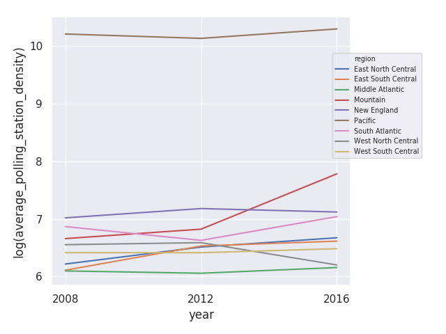
This line plot shows change in average polling station density (number of voters per polling station) across years by Census division. (We take the natural log for better visualization.)
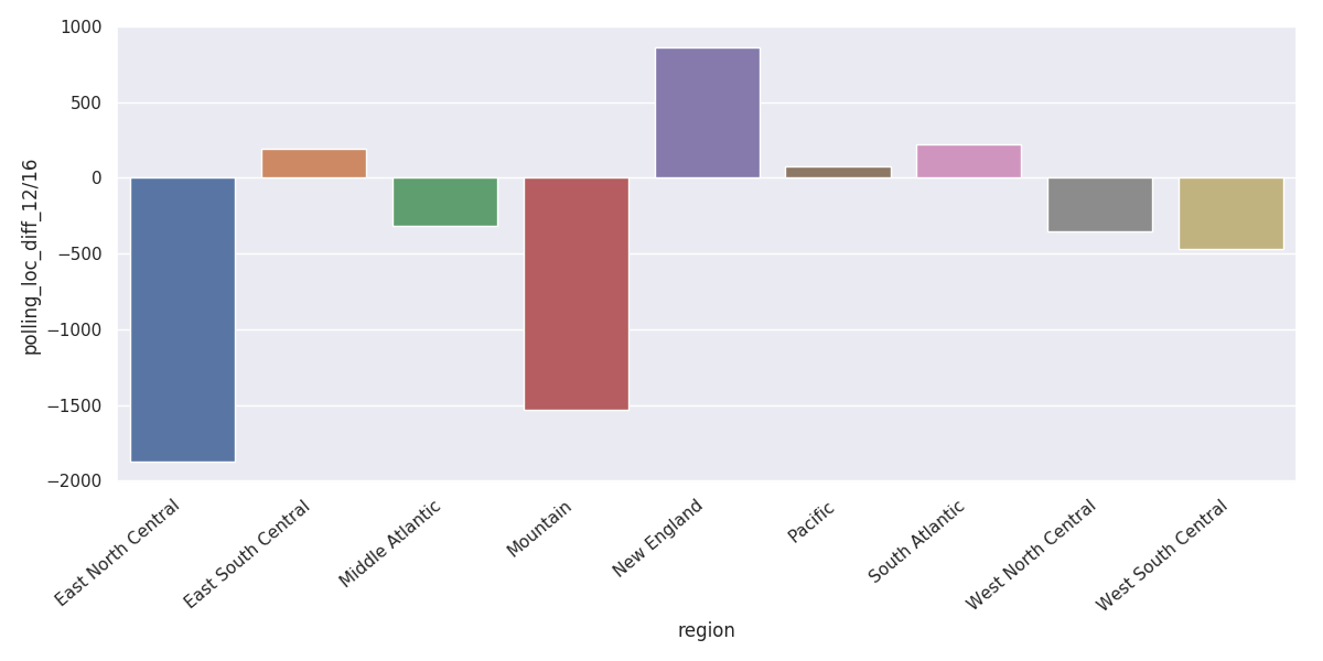
We found that the average polling station density increased significantly in the Mountain area from 2012 to 2016, indicating that the ratio of voter population to number of polling stations rose greatly in this area.
This also corresponds to the decrease of polling stations, which is reflected in both the bar-plots.

These trends are further corroborated in the maps.